1)This guideline specifies the following recommendation grades for the use of the graphical symbols. Be sure to observe these recommendations when using the graphical symbols.
2) The graphical symbols marked with "Note 1" are to be used with supplement text. Avoid using the graphic symbols alone. For details on the text usage, see the text example shown with each graphical symbol.
3) For the graphical symbols marked with "Note 2," the currency symbol in the graphical symbol can be replaced with another currency symbol if necessary.
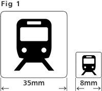
4) The graphical symbols in this guideline are designed with minimum dimensions of 35 mm × 35 mm square when displayed with a viewing distance of 1 meter, and minimum dimensions of 8 mm × 8 mm square when used for maps viewed while being held. Avoid using the graphical symbols in dimensions smaller than these. (Figure 1)
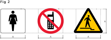
5) The dimensions of the shapes and graphical symbols in this guideline have been adjusted so that squares, circles, and triangles look the same size. Keep this in mind when mixing graphical symbols with these three types of shapes and when enlarging or reducing them. (Figure 2)
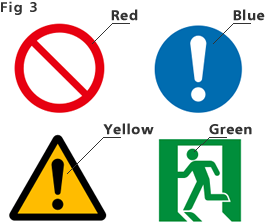
6) The red, blue, yellow, and green colors used for the graphical symbols shown in this guideline are based on "JIS Z 9103-2017, Safety colors and safety signs". See the following values when using colors. (Figure 3)
Note: The colors printed in this guideline are approximate because regular ink is used.
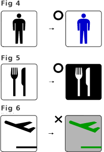
7) For graphical symbols depicted in black on a white background, these colors can be changed to other colors with the exception of the red, blue, yellow and green safety colors mentioned above. (Figure 4) The colors used for the graphical symbol and its background can also be reversed. (Figure 5)
8) When adjusting the color tone or lightness, keep good visibility in mind so that there is sufficient contrast between the graphical symbol and its background color. Make sure that the difference in lightness between the figure and the background color is at least 5 values or more in the Munsell color system with 0 to 10 levels. (Figure 6)
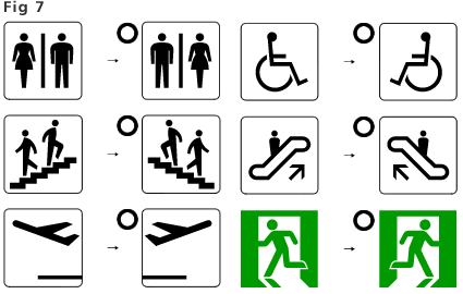
9) Some graphical symbols can be reversed left and right depending on the guidance direction and installation environment. (Figure 7 shows some examples.)